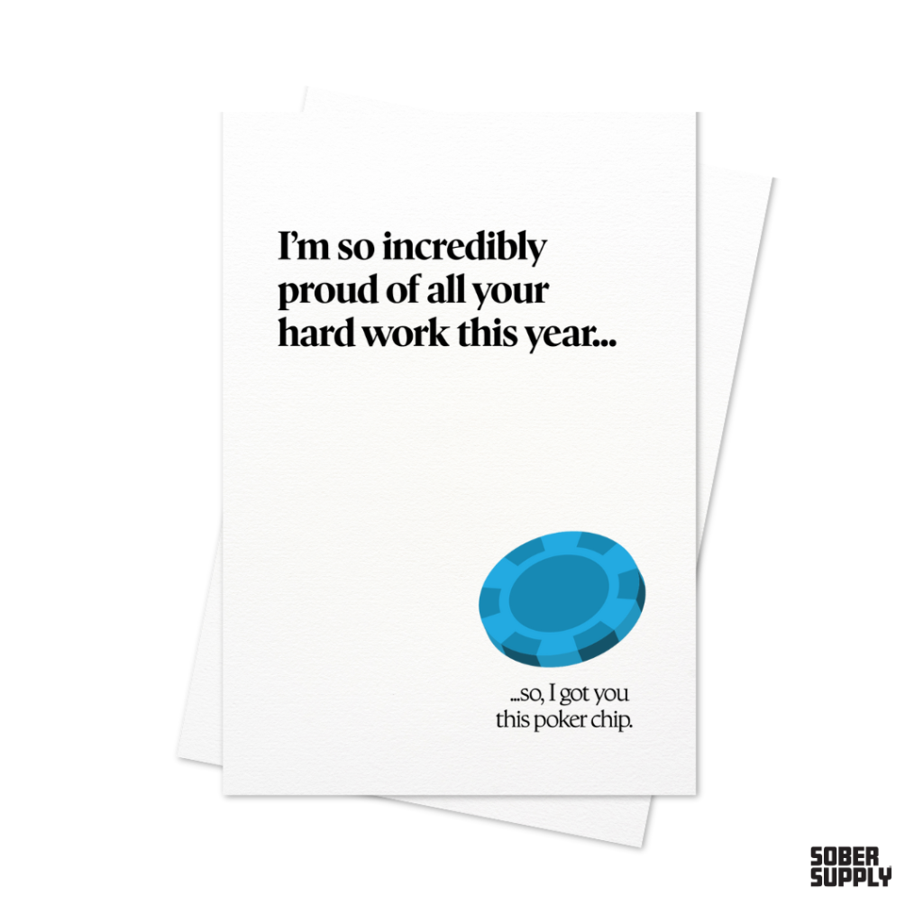
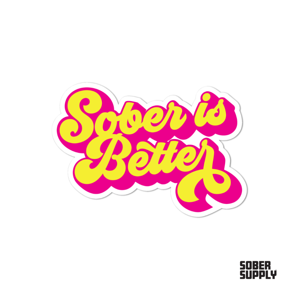
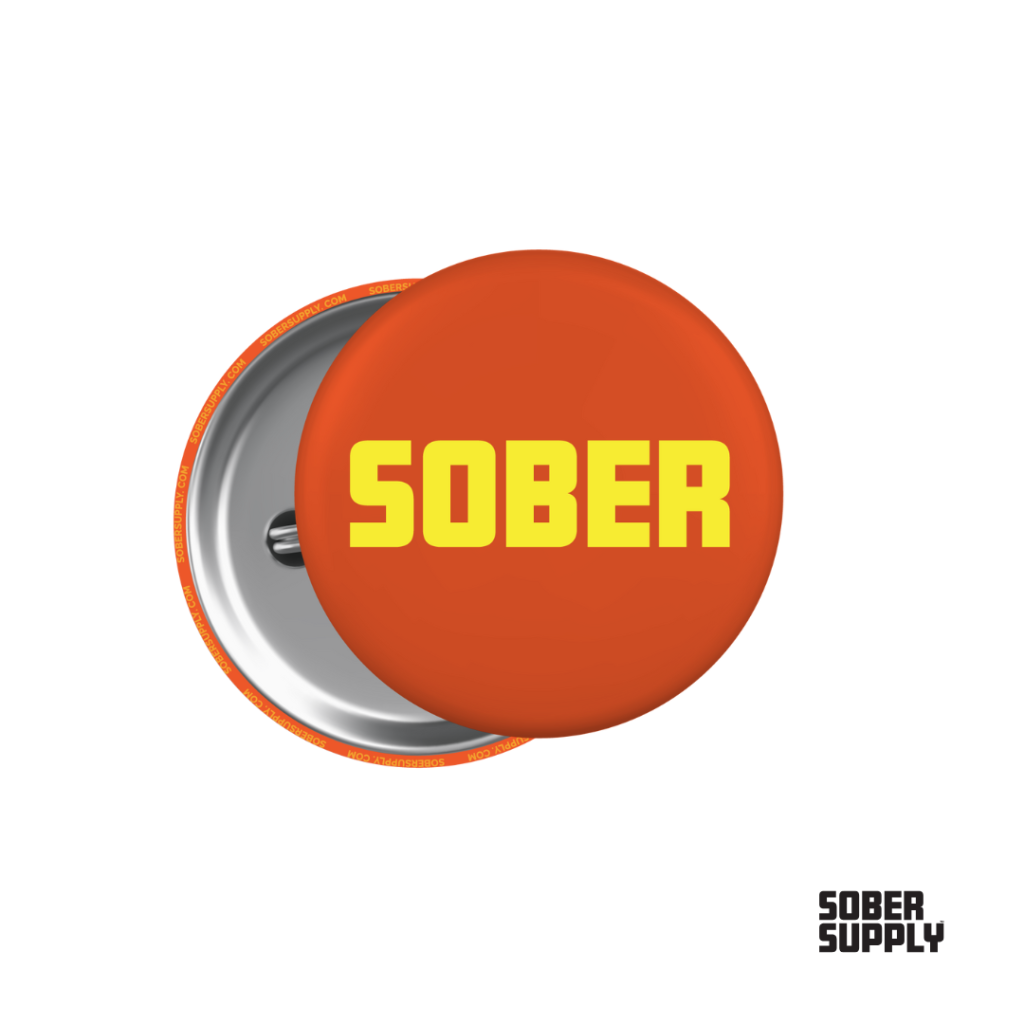
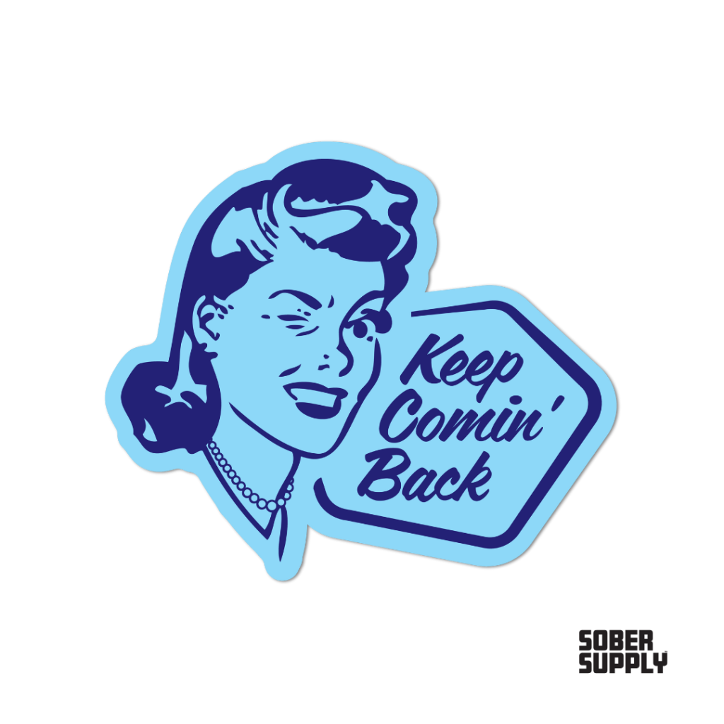
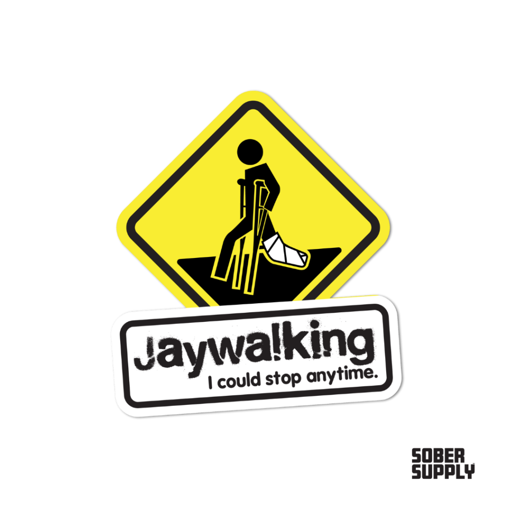
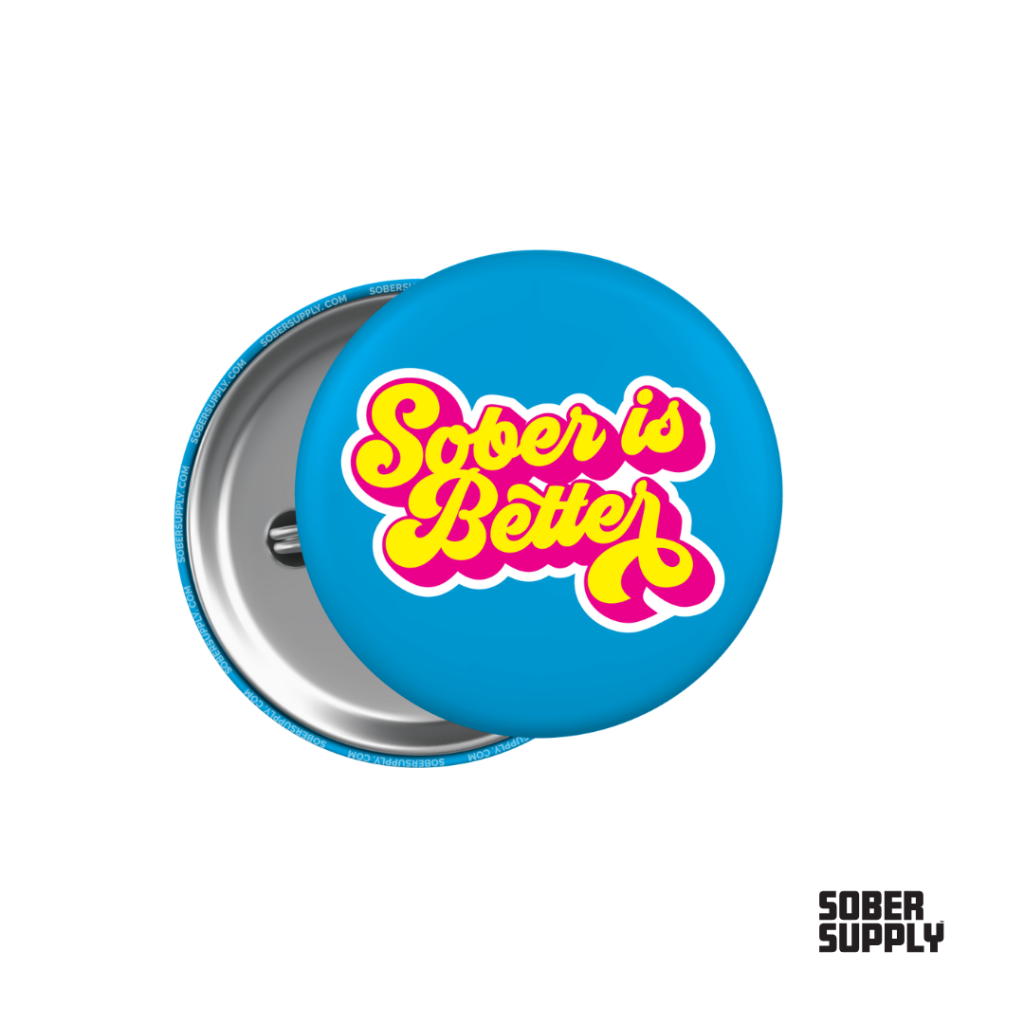
Launched Sober Supply, a brand dedicated to supporting the sober community.
The t-shirt and sticker designs blend humor with common phrases and ideas that resonate with the recovery community.
Creative Services for Small Businesses and Nonprofits in Atlanta, GA
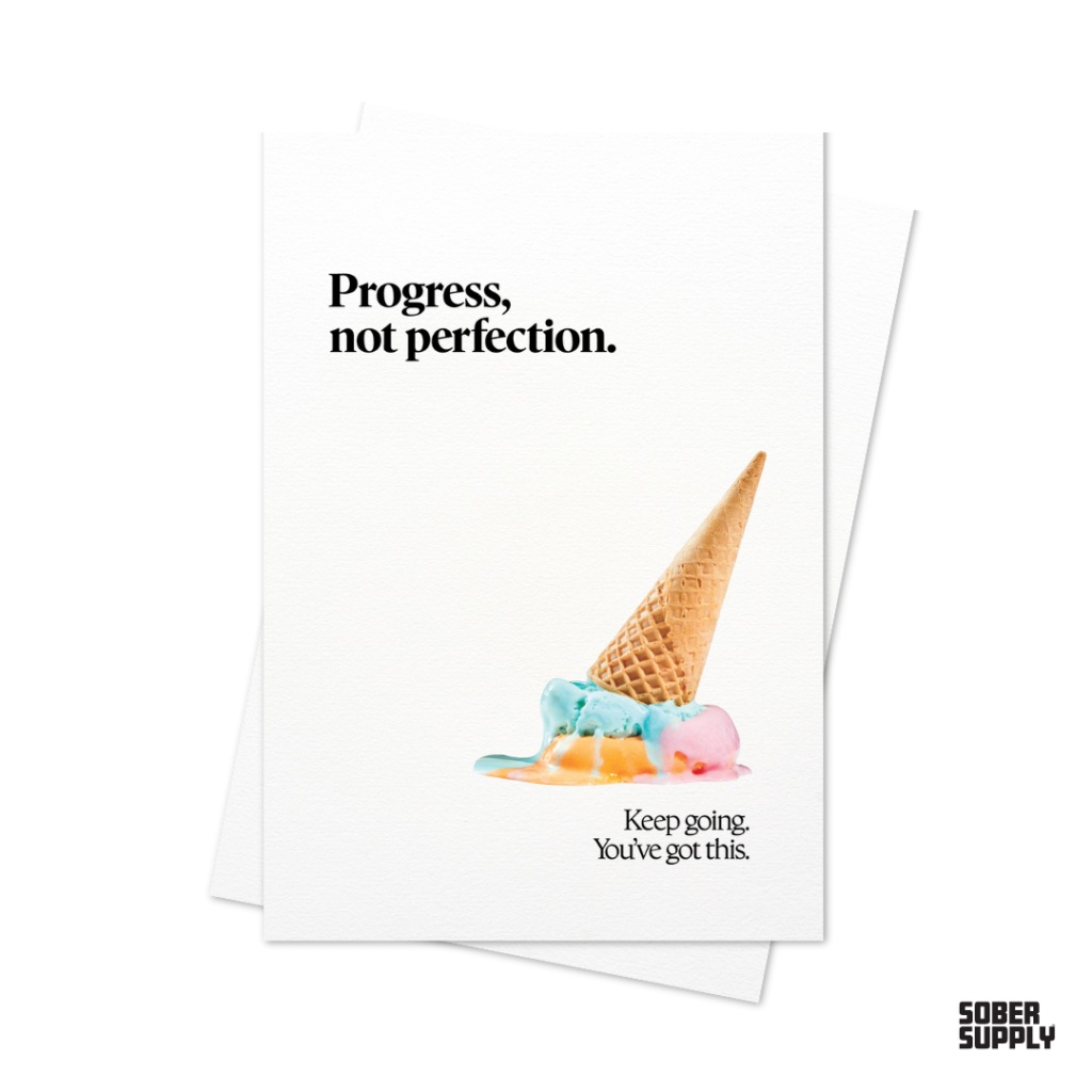
Launched Sober Supply, a brand dedicated to supporting the sober community.
The t-shirt and sticker designs blend humor with common phrases and ideas that resonate with the recovery community.
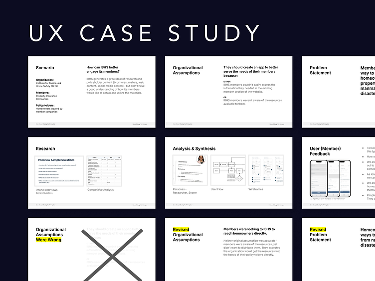
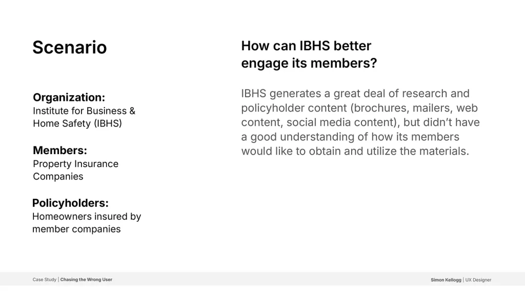
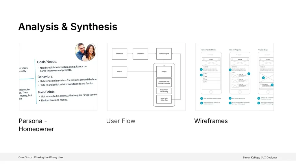
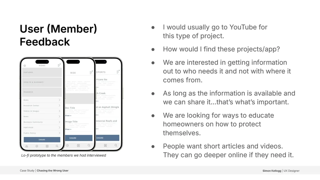
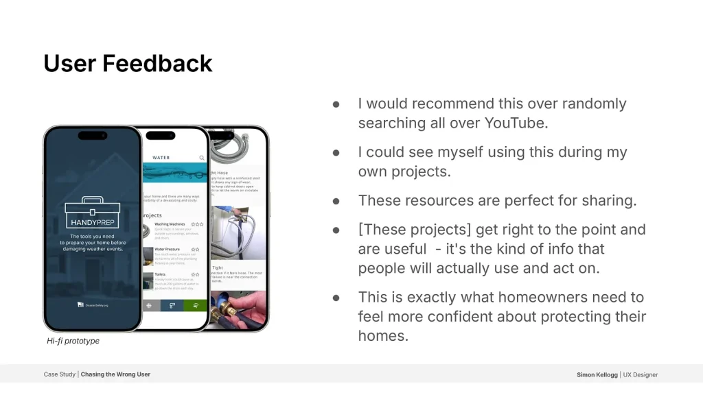
A case study highlighting the importance of identifying the correct problem to solve and the importance of user feedback.
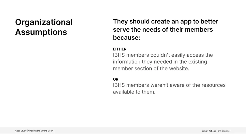
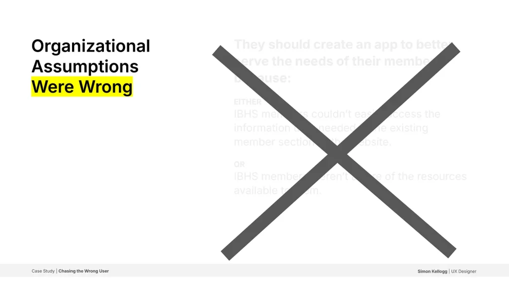
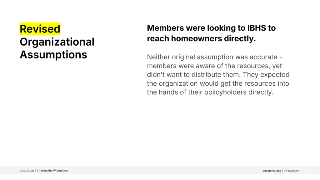
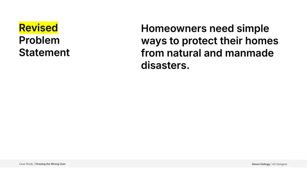
With the goal to improve member engagement I was tasked with rethinking how their resources were distributed. Through research, wireframing, and user feedback, I discovered that while members were aware of available resources, they expected IBHS to provide these directly to policyholders.
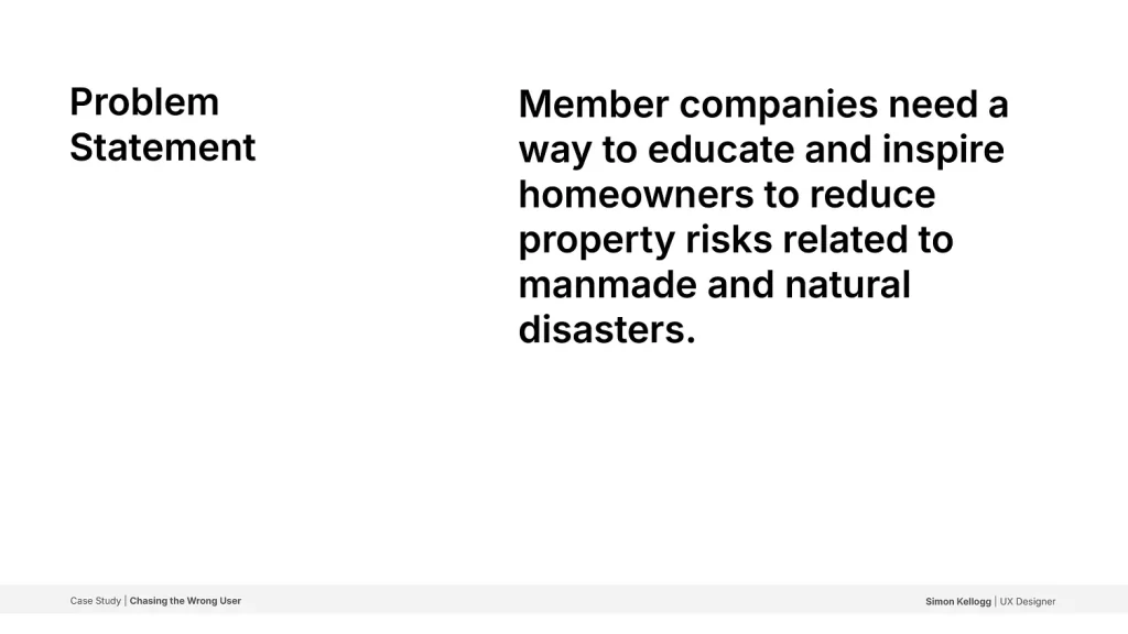
This led to a pivot in the design approach, shifting focus towards providing homeowners with simple, actionable content to help them protect their homes from natural and manmade disasters.


Crafted a logo for a successful endodontist practice that effectively balances clinical precision with a welcoming vibe, aligning with the client’s vision.
Since root canals often cause anxiety among patients, we opted to focus on approachability and a modern take on dental care. The logo integrates a tooth, including the root, while calling forth a natural, friendly, warm aesthetic.
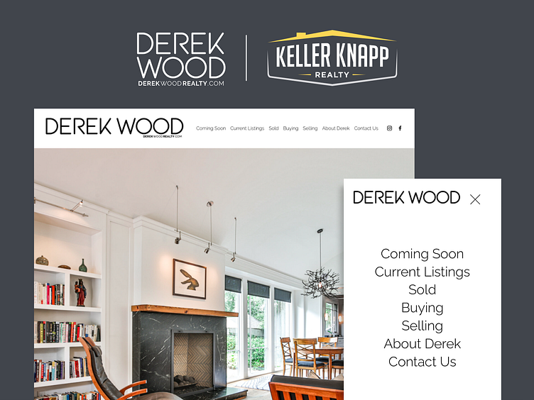
Designed brand identity and a website for an Atlanta that reflects the high caliber of homes listed and sold, as well as his impeccable dedication to the client experience.
—
Derek’s business was expanding quickly and he had outgrown his initial web presence. He was looking for help in creating a fresh online home for his agency.
We worked with Derek to understand the underlying goals and motivations of potential clients and built a brand and online experience to met the needs of homebuyers and sellers in the Decatur market.
DISCOVERY & STRATEGY
Derek intuitively understood his clients, yet didn’t have specific positioning and segmentation data.
REDESIGN
He wanted his brand and site to reflect the caliber of homes and service he provides his clients.
USER-FOCUSED
Realtors sell themselves as a service. The site needed to balance showcasing Derek with the properties.
DISCOVERY & STRATEGY
We conducted a competitive market analysis and developed buyer personas to inform the redesign.
REDESIGN
Clean typography and design elements convey professionalism and trust, ensuring the brand stands out in a highly competitive market. The website focuses on simplicity of user experience, getting available properties in front of potential buyers quickly and effectively.
USER-FOCUSED
We determined clients were drawn to images of clean, modern home interiors. We balanced imagery with quotes highlighting Derek’s personal approach.
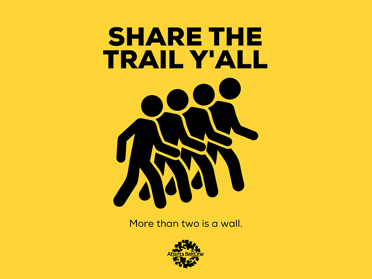
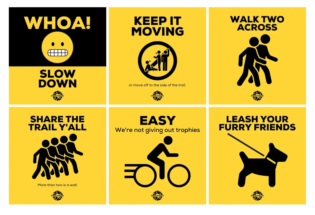
Series of signs for the Atlanta Beltline encouraging folks using the trail to act right and avoid creating inadvertent safety hazards.
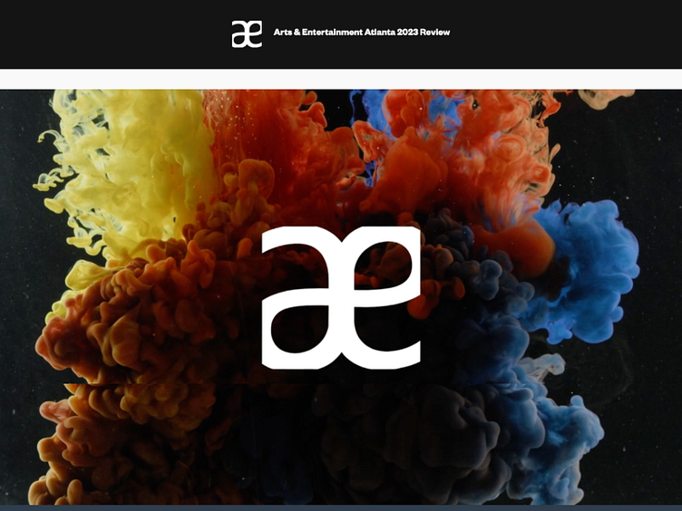
“Established in 2017 by Atlanta City Council legislation, Arts & Entertainment Atlanta (A&E Atlanta) is a neighborhood activation and economic development project for Downtown Atlanta. A&E Atlanta fuses new media, local art, and performance with advertising to fund cultural and public space programming in the city’s core.” – Arts & Entertainment Atlanta
Created a dynamic video highlighting the artists selected to participate 2023 installations. The video captures the vibrant creativity of Atlanta’s arts scene, utilizing bold colors and fluid motion.
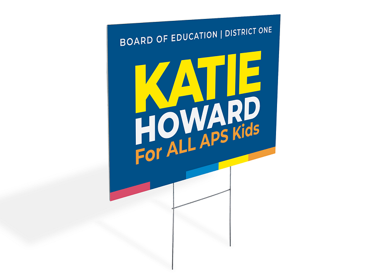
Created a bold, vibrant brand identity–one that aligns with her personality and energy–for Katie Howard’s successful campaign for the Atlanta Board of Education.
The brand emphasizes her commitment to inclusivity and education for all students, using strong typography and a dynamic color palette that conveys fresh energy and approachability.
The brand was implemented across various campaign materials, ensuring a cohesive and recognizable visual presence. After an initial term on the Atlanta Board of Education, Katie Howard was reelected, cementing the long-lasting impact of her brand.

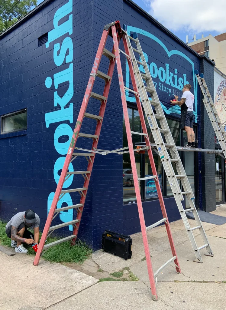
Worked with Bookish Atlanta founder to create and launch brand identity for the community-focused bookstore located in East Atlanta.
The open book in the store logo is a nod to the tagline “Every Story Matters.” Bold typography mixed with a serene color palette creates a welcoming, approachable vibe that aligns with Bookish Atlanta’s mission to create a space where diverse narratives are celebrated and reading is accessible to all.

I ❤️ Bookish graphic for Bookish Atlanta’s promotional materials.

Read What You Like: Graphic designed to pull forward Bookish Atlanta’s message that reading should be fun, engaging, and accessible to every person.